Showing posts with label artwork. Show all posts

Thursday, July 02, 2015

Mapping the Fantastic: Four New Maps added to the Thrones & Bones Website

The Thrones & Bones website is undergoing an expansion in anticipation of Nightborn's release. One of the first bits of new content is the addition of four new maps by amazing cartographer Robert Lazzaretti (of Dungeons & Dragons and Pathfinder fame). This bring the total number of maps on the site to six, all by Lazzaretti. He and I have worked very closely together to get the details of the world of Thrones & Bones exactly right (called the world of Qualth, with our focus thus far being on the continent of Katernia and the neighboring island-continent of Thica). I'm so fortunate to work with such a talented artist. Check out his gorgeous work and see more of the world of the Thrones & Bones series!

Last week, I interviewed Lazzaretti for Mundie Kids about his work on the T&B series. You can read our interview here.

Thursday, June 18, 2015

Desktop/Laptop Wallpaper for Thrones & Bones

Want wallpaper for your desktop and laptop with art from the Thrones & Bones series? Well, you're in luck. The website Ex Libris just debuted the first Thrones & Bones wallpaper today. This is a scene from the first novel, Frostborn, showing Karn and Thianna as they stumble upon Helltopp's Barrow. (If you zoom in, you can see the corpse door in the opening of the mound!). The illustration is by the amazing Andrew Bosley, who also does artwork on the Thrones & Bones website.

The wallpaper is available in a variety of sizes and you can download it here! 


Monday, June 15, 2015

2015 Chesley Award Nominations


I resigned as an editorial director and art director in September, 2014 to become a full time children's book author.However, work that I acquired featuring cover images which I directed is still coming out. I am very thrilled therefore to learn that I have been nominated for the Chesley Award in the category of Best Art Director. This is my eight Chesley nomination (I won in 2009), and I am as humbled and honored as I ever was to be included alongside such prestigious company as 
Shelly Bond (DC/Vertigo Comics), 
Irene Gallo (Tor & Tor.com
), Jeremy Jarvis (Wizards of the Coast), and Lauren Panepinto (Orbit Books). Congratulations to all the nominees, and thank you to the fabulous artists with whom it was my pleasure to collaborate.

And speaking of... several works which began life under my tenure as art director are on the ballot as well in the category of Best Cover Illustration - Paperback. Huge congratulations to the geniuses behind these nominations:

The 2015 Chesley Awards will be held at Sasquan, the 73rd World Science Fiction Convention, Spokane, Washington, USA on August 19-23, 2015. Ceremony times to be announced.

Meanwhile, I am happy to say that I am still collaborating with artists these days, working with several really talented folks on projects in and around the Thrones & Bones series. Only a fraction of this artwork has been made public but there is a lot to come in a very short time!

Here is the complete list of 2015 Chesley Award Finalists. Congratulations to us all!

Best Cover Illustration / Hardcover
Julie Dillon, Shadows Beneath: The Writing Excuses Anthology edited by Brandon Sanderson; Dragonsteel Entertainment, June 2014
Jon Foster, Zombie Baseball Beatdown by Paolo Bacigalupi; Subterranean Press, 2014
Todd Lockwood, The Tropic of Serpents by Marie Brennan; Tor, March 2014
John Picacio, Endymion by Dan Simmons; Limited Edition, Subterranean Press, December 2014
Michael Whelan, Words of Radiance by Brandon Sanderson; Tor, March 2014
Best Cover Illustration – Paperback
John Harris, Ancillary Sword by Ann Leckie; Orbit October 2014
Jon Sullivan, The Return of the Discounted Man by Mark Hodder; Pyr, July 2014
Raymond Swanland, The Lady by K.V. Johansen; Pyr, December 2014
Danielle Tunstall, Unseaming by Mike Allen; Antimatter Press, October 2014
Raoul Vitale, Nebula Awards Showcase 2014 edited by Kij Johnson; Prometheus/Pyr
Best Cover Illustration – Magazine
Julie Dillon Analog April 2014
Matt Dixon, Clarkesworld #90 March 2014
Wayne Haag, Interzone #253 July/August 2014
Patrick Jones, Analog March 2014
Jae Lee, Batman/Superman #14 DC Comics October 2014
Peter Mohrbacher, Lightspeed #48 May 2014
Dan Dos Santos, Serenity: Leaves on the Wind #3 Dark Horse, March 2014
Best Interior Illustration
Anna Balbusso and Elena Balbusso, “Ekaterina and the Firebird” by Abra Staffin-Wiebe; Tor.com, January 2014
Galen Dara, “A City of Its Tentacles” by Rose Lemberg; Lackinton’s #1 February 2014
Julie Dillon, Imagined Realms: Book 1 July/August; Kickstarter December 2014
Scott Gustafson, Classic Bedtime Stories; Artisan, September 2014
Karla Ortiz, “The Walking Stick Forest” by Anna Tambour; Tor.com May 2014
John Picacio, Nuestra Senora de la Esperanza; Tor.com October 2014
Best Gaming Related Illustration
Noah Bradley, Drown in Sorrow Magic card, Born of the Gods; WotC, Feb. 2014
Eric Deschamps, Ephara, God of Polis Magic card, Born of the Gods; WotC, Feb. 2014
Michael Komarck, D&D The Rise of Tiamat; WotC, Oct. 2014
Peter Mohrbacher, Pharika, God of Affliction Magic card, Journey into Nyx; WotC, May 2014
Karla Ortiz, Ghoulcaller Gisa Magic card, Commander 2014; WotC, Nov. 2014
Chris Rahn, Ajani the Steadfast Magic card, 2015 Core Set; WotC, July 2014
Best Product Illustration
Frank Cho & Brandon Peterson, Fast Food New York ComicCon 2014 art print
Donato Giancola, George R.R. Martin Song of Ice and Fire 2015 calendar Bantam, 2014
Patrick Jones, Conan The Conquered Illuxcon promotional art
John Picacio, La Calavera Loteria card Lone Boy
Raymond Swanland, One with the Light Limited Edition Giclee on canvas Acme Archives 2014
Best Color Work – Unpublished
Linda Adair, Dragonsbride oil
Michael C. Hayes, Alegretto oils
Reiko Murakami, Giving Name Photoshop
Mark Poole, Omens oils
Dorian Vallejo, Crossing oil on canvas
Annie Stegg Gerard, The Lady of Lorien oil on linen
Best Monochrome Work – Unpublished
Kristina Carroll, “Dragonslayer” charcoal
Sean Murray, “Gateway: The Storkfriars” graphite
John Picacio, El Venado, graphite
Olivier Villoingt, “The Soul of War” graphite & acrylic
Allen Williams, “Sphynx” graphite
Rebecca Yanovskaya, “Wisdom” ink & mixed media
Best Three-Dimensional Art
Dan Chudzinski, The Mudpuppy, resin & mixed media
David Meng, Sun Wukong, the Monkey King
Michael Parkes, Meditation, bronze
Forest Rogers, A Fish from Versailles, Kato polyclay
Virginie Ropars, Morrigan, polymer clay & mixed media
Vincent Villafranca, Modernity’s Squeaky Child, bronze & steel
Best Art Director
Lou Anders, Pyr
Shelly Bond, DC/Vertigo Comics
Irene Gallo, Tor & Tor.com
Jeremy Jarvis, Wizards of the Coast
Lauren Panepinto, Orbit Books
Lifetime Artistic Achievement Award
Kinuko Craft
John Harris
Gregory Manchess
Iain McCaig

Monday, November 26, 2012

The Making of The Creative Fire

Over at the collective artists blog, Muddy Colors, John Picacio talks about his inspiration for creating the cover for Brenda Cooper's The Creative Fire (Book One of Ruby's Song). He shows some classic paintings that inspired his piece, as well as rare glimpses into his pencils and early process pieces.

From John's piece:
"All of us are living in a fragile time for our fundamental rights, at least here in America. It seems our news and social feeds are filled with daily attacks on womens' rights. Revolutionary posters have always been rallying cries, and Lou and I felt like we might have a chance to evoke those here, as well as serve the novel's intentions. When I thought about who Ruby was, I thought of the 1940's image of Rosie the Riveter, as imagined by J. Howard Miller and Norman Rockwell (with genius inspiration from Michelangelo's Sistine Chapel). I thought of the grace of Sandro Botticelli's The Birth of Venus, along with Russian revolution posters, and Howard Chandler Christy's 'Fight or Buy Bonds' painting."

Tuesday, October 30, 2012

Photo to Concept Art in 15 minutes (speed x3)

Jonas De Ro recorded this video (speed up x3) to show how he went from a photo to a finished piece of concept art in 15 minutes. It's pretty inspiring to see:

Monday, October 29, 2012

The 2013 John Picacio Calendar

 Hugo Award-winning and Chesley Award-winning artist John Picacio has just announced a Kickstarter project for a 2013 calendar featuring twelve of his fantastic illustrations. This is the first project from his new company, Lone Boy, and a very exciting one. The full-color 12” x 12” 2013 wall calendar collects twelve of John's personal favorite book cover artworks from his career to date. The calendar’s cover will be printed on 12 pt. premium paper stock, with a satin aqueous-coated finish, and the interior pages will be printed on 100# text. The interior image area will be a larger-than-normal 12” x 16”. Depending on your pledge, you could get your own copy of the calendar, signed archival prints, process drawings, your name printed on a full run of the calendars, and/or the opportunity to model for an upcoming published science fiction/fantasy artwork by the artist.

Here is John's pitch for the project:


And here is the calendar's artwork by month:
  1. JANUARY: Fast Forward 2 edited by Lou Anders (Pyr)
  2. FEBRUARY: Muse Of Fire by Dan Simmons (Subterranean)
  3. MARCH: Elric: Sword And Roses by Michael Moorcock (Random House/Del Rey)
  4. APRIL: Age Of Misrule: World’s End by Mark Chadbourn (Pyr)
  5. MAY: Hyperion by Dan Simmons (Subterranean)
  6. JUNE: A Canticle For Leibowitz by Walter M. Miller, Jr. (HarperCollins/Eos)
  7. JULY: The Creative Fire by Brenda Cooper (Pyr)
  8. AUGUST: Gateway by Frederick Pohl (Random House/Del Rey)
  9. SEPTEMBER: The 13th Reality: The Journal Of Curious Letters by James Dashner (Simon & Schuster/Aladdin)
  10. OCTOBER: Memoranda by Jeffrey Ford (Golden Gryphon Press)
  11. NOVEMBER: Drood by Dan Simmons (Subterranean Press)
  12. DECEMBER: Away From Here (Asimov’s Science Fiction, September 2009)
What are you waiting for? Pledge!

Friday, September 21, 2012

Painting Process: The Making of "Omens"

Cynthia Sheppard is a wonderful artist, who, incidentally, did our covers for Mirror Mazeand Hunter and Fox.

In this YouTube video, she shows us the process for creating one of her paintings. It's a fascinating and beautiful 10 minutes well worth your time.


Thursday, September 20, 2012

XKCD: Click and Drag

This recent edition of XKCD is astounding. It may also be that really, truly rare thing called "something new." I cannot imagine the work that went into this. I'm stunned. (Also, make sure you go underground).

Monday, June 18, 2012

2012 Chesley Award Nominations

ASFA, the Association of Science Fiction and Fantasy Artists, have released the finalists for the Chesley Awards. The cover artists for three Pyr novels are finalists in the category of Paperback Books:

Justin Gerard for Hearts of Smoke and Steamby Andrew P. Mayer
Lucas Graciano for The Goblin Corpsby Ari Marmell
Jon Sullivan for The Curious Case of the Clockwork Manby Mark Hodder

I'm also thrilled at the news (which I got at 1 am Saturday night) that I've just received my fifth Chesley Award nomination in the category of Best Art Director. I'm tremendously humbled to be sharing this honor with fellow nominees Matt Adelsperger (WotC), Irene Gallo (Tor), David Palumbo (Night Shade Books), and Jon Schindehette (WotC).

The Chesley Awards were established in 1985 by the Association of Science Fiction and Fantasy Artists to recognize individual artistic works and achievements during a given year. The Chesleys were initially called the ASFA Awards, but were later renamed to honor famed astronomical artist Chesley Bonestell following his death in 1986. The awards are presented annually at the World Science Fiction Convention.

Congratulations to all the nominees! 

Saturday, June 25, 2011

Artists: Don't Miss This Year's Worldcon

The following post is from John Picacio's blog. I'm reposting it here because it's IMPORTANT:
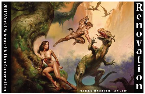
(Art by Worldcon Artist GoH Boris Vallejo.)
I'm stoked about this year's World Science Fiction Convention in Reno. Kudos to Colin Harris, Anne Gray, Laurie Mann, Jannie Shea, Laura Domitz, Joni Dashoff, Patti Wells and company for working overtime to make this the best Worldcon for sf/f artists in years.

If you're an established pro, an aspiring pro, or anywhere in between, this is the year to do Worldcon. Don't wait 'til next year. Don't wait 'til the year after. This one. Why? Because Worldcon is offering new opportunities for registered, participating Worldcon artists and there's zero guarantee these features will be carried on in future years.

Check 'em out:

1. FREE Artist Tables in the Dealers' Room: Worldcon has reserved two free tables in the Dealer's Room for artists to interact with fans and the con at-large. Artists can chat, sign and sell artwork (other than what has been placed in the Art Show), sculpt, sketch, or whatever. This space will be in the section of the Dealers' Room closest to the Art Show, which will be set up as an Artist Alley. Boris Vallejo, Julie Bell and others will have tables there; details here. ONLY Art Show participants are being offered this opportunity to reserve an Artist Alley table for two hours at a time to promote their work - at no cost to the artists (although Nevada sales tax rules apply). Email art@renovationsf.org to schedule a time slot or two at these special tables in Artist Alley.

2. 'Meet the Artist' Events: There will be two Meet The Artist events in the Art Show during the convention. The first is part of Art Night and runs from 7:00 PM to 8:30 PM on Thursday. Some artists will be scheduled to do demos and panels at 8:00 PM. The second event will be Saturday morning at 11:00 AM. Should be a lot of fun as it gives Art Show artists and art lovers a chance to visit and hang out.

3. Artist Showcase Booklet: For the first time, Worldcon will print a full-color collectible booklet for sale at the convention, featuring artist info and galleries. Only registered Art Show artists will be featured. Brilliant move by this year's Worldcon art committee folks. I'm really looking forward to seeing this.

4. Illustration Masterclass taught by Richard Hescox: Learn from a Chesley Award-winning painting master. This opportunity is worth the price of admission by itself for aspiring artists. Spread the word about this one. I think this is a very cool opportunity on the part of Richard and Worldcon. Space is limited. Don't miss out!

5. Art Portfolio Reviews: Another invaluable opportunity for all job-seeking artists. Portfolio reviews by Guest of Honor Boris Vallejo and a range of industry Art Directors including Jon Schindehette, Lou Anders and David Palumbo. Again, space is limited. Tell your friends, but if I were you, I'd apply as soon as possible.

6. The Chesley Awards: Of course, the Chesleys are not new to the Worldcon effort. They're a tradition, especially when Worldcon is stateside. And they'll be the highlight of Worldcon's Art Night festivities on Thursday evening. The Chesleys are the awards administered by the Association of Science Fiction and Fantasy Artists and ASFA will again host the Chesleys this year.

I love what Worldcon is doing this year. Amongst the art stars attending: Boris Vallejo, Julie Bell, Dave Palumbo, Bob Eggleton, Richard Hescox, Lee Moyer, Vincent Villafranca, Martina Pilcerova, Alan Beck, Anthony Palumbo, Winona Nelson, Irene Gallo, Lou Anders, and Jon Schindehette. And many more besides them. Not too late to join the fun. This is gonna be an amazing show. :)

Monday, December 20, 2010

John Picacio's GRRM Calendar

George RR Martin has posted a (possibly not final) image of the cover of the 2011 and 2012 A Song of Ice and Fire Calendars. Ted Nasmith is the illustrator of 2011 and John Picacio of 2012. Both look amazing, but I'm particularly excited by the Picacio. George says, "This may not actually be the final cover, but it should give you a good taste of the spectacular work that John is doing. He tells me he's determined to make this calendar the best work he's ever done." Excited.

Sunday, June 06, 2010

Behind the Mask: The Evolution of a Super Cover

Designer Richard Yoo worked on the cover treatment for my forthcoming comic heroes-in-prose anthology, Masked. Over on his blog, he posts several interesting cover concepts that were explored before artist Trevor Hairsine was brought in, as well as type treatments after he was. (Note that Masked was originally titled With Great Power).

Masked will be released by Gallery Books this coming July, with an amazing list of contributors that includes Bill Willingham, Marjorie M Liu, Gail Simone, Mike Carey, Peter David, and Mike Baron.

Thursday, April 01, 2010

With Great Power... Comes Great Cover Art!

Now it can be shown, the fantastic cover art to With Great Power..., my forthcoming anthology of superhero prose stories, out from Pocket's new Gallery Books imprint in July. The art is by Trevor Hairsine, artist on such titles as Judge Dredd, Captain America, Wisdom, Ultimate Galactus, Black Panther and many other comic books.

Once again, here's the awe-inspiring Table of Contents:

Introduction: The Golden Age by Lou Anders
"Cleansed and Set in Gold" by Matthew Sturges
"Where their Worm Dieth Not" by James Maxey
"Secret Identity" by Paul Cornell
"The Non-Event" by Mike Carey
"Avatar" by Mike Baron
"Message from the Bubblegum Factory" by Daryl Gregory
"Thug" by Gail Simone
"Vacuum Lad" by Stephen Baxter
"A Knight of Ghosts and Shadows" by Chris Roberson
"Head Cases" by Peter David & Kathleen David
"Downfall" by Joseph Mallozzi
"By My Works You Shall Know Me" by Mark Chadbourn
"Call Her Savage" by Marjorie M. Liu
"Tonight we fly" by Ian McDonald
"A to Z in the Ultimate Big Company Superhero Universe (Villains Too)" by Bill Willingham

Wednesday, February 03, 2010

ArtOrder's Latest "Ask the Art Director" series

Another great post by Jon Schindehette in his ArtOrder "Ask the Art Director" series. This one asks, "Can I Be a Cover Artist?" Great responses from artist Todd Lockwood, Tor Art Director Irene Gallo, Wizards of the Coast's Kate Irwin, illustrator Ralph Horsley, CthulhuTech Art Director Mike Vaillancourt, and Yours Truly. For anyone interested in illustration, not just those looking for a career in it, the post is well worth checking out.

Thursday, December 10, 2009

Matte vs Gloss

Earlier this week, a Canadian bookseller and blogger published "An Open Letter to Trade Publishers," opining that the use of gloss finishes on trade paperback books caused some shoppers to mistakenly assume these titles were self published efforts from vanity press. She writes:
"Dear Trade Publisher or Small Press publisher:

Please do not print trade paperback large format books with flat glossy covers anymore.
As a bookseller, I watch what people pick up and put down. I listen to their comments on covers and cover art (and blurbs; those are sometimes funny, and yes, I know full well that the authors don't write them).

One thing that I've noticed happening more and more often in the store when people are browsing and chatting in front of the New Release Trade paperback shelf is that a customer will point at a specific book and say:

"Is this self-published?"

or

"Wow, there are a lot of self-published books here."

In fact, none of the books at which they're pointing are self-published"
She then singled out our own recent release, Diving Into the Wreck, specifically, saying:
"The British trades are frequently bound with glossy stock. This week, there were two novels by relatively unknown names -- and the new Pyr title by Kristine Kathryn Rusch -- which were pointed out, and which were instantly classified as "self-published" (the latter, I've had four people ask about in the last two weeks)."

This has caused some huge discussion at the site itself, on my Facebook page, on Twitter, on John Picacio's Facebook page, and in the numerous emails I've been getting from people who have stumbled across it.

A follow up post appeared the next day, it which she very kindly added:
"Let me be even clearer: 
I admire Pyr and its publication choices greatly. I think some of the best, if not the best, SF being published in North America is being published by Pyr books. I am not in any way saying the books look or are unprofessional to me.

I'm saying that the cover-stock, which is in some ways more durable than other finishes ... is causing consumer confusion in my experience."
Now, let me say right off the bat that I'm not upset about the first post, I appreciate the spirit in which it is offered as well as the information it contains, and I certainly appreciate the nice things she says in the second one. Furthermore, this is feedback, this is a data point, and as someone who wants to connect the most books with the most readers, I am happy to and obligated to consider all data points. Anything that gets more books into your hands is a good thing. Any potential impediment to that must be considered and evaluated.


A lot of what resulted was people coming down pro or anti-matte. There was a lot of good feedback. And also the point raised, most eloquently by Bruce Arthurs that:
"What bothers me about this is that you're asking professional publishers to limit their options....The 'tells' I generally see to distinguish self-published from professional books aren't the glossiness of the cover stock. Poor cover art, and clunky typography and layout are a much greater factor. They're not always 'bad,' but they're almost always 'off.'"
Now, another interesting factor. It was quickly pointed out that the author of the post is Canadian, and that, due to the generous subsidies and grants that the Canadian government provides for writers (and that I wish the US government would too) there are a lot of self published books in bookstores in Canada due to big government artist subsidies. While this particularly bookseller stressed their store did not stock vanity press titles, it may nonetheless be that there is a particular  suspicion of and sensitivity towards self-publishing among Canadian shoppers.

So there is a degree to which I think this may not be as relevant to the American market as it is to the Canadian one. 


The other factor that needs discussing is that this is not a discussion of quality but of perception. The matte covers being advocated here frequently curl, scratch horribly, are generally less durable, and, most crucial in my opinion, dull and blunt the artwork. We had a situation once where a blogger criticizes our paper stock, saying it didn't look like the other books on his shelf. We contacted them, asking them to specify examples of which paper they preferred. It turned out they liked the really low-end, low-weight, see through, cheap paper generally reserved for mass market books and now sadly starting to creep into some trade paperback and even (horribly!) to some hardcovers as a cost cutting measure. The fact that our paper was thicker, creamier, more durable and way more expensive was seen as a bad thing.

As John Picacio elegantly put it:
"If someone thinks McDonald's burgers are the best burgers ever, and the way burgers should be made, and then they go to Peter Lugar's in NYC, and hate the gourmet burgers because they aren't like the 'major chain,' then does that mean Peter Lugar's should make their burgers like McDonald's?"
Hell no. So there's a very real degree to which I am unwilling to make our books look cheaper, less durable, and, well, uglier if that's what it takes to "blend in." When I select a manuscript for a Pyr book, I want it to be something you will love, and want to read over and over, and I want it packaged beautifully in something that will last.

But, again, it's a data point. If the perception exists among US shoppers, which is where the majority of our books are sold (us being a US publisher), then I need to address it.


So, yesterday, I went to  Barnes & Noble to get some more data points. I started in the As and went to the Zs, to see just who was publishing what in trade paperback covers with gloss finishes. The following authors were all published in this manner, and their books had no foil or embossing - just gloss finishes on trade paperbacks. This is not a complete list, not by any means; it's just as much as I could jot down on my iPhone in the five minutes I had before I had to rush home to my family. So, in gloss trade paperback we have: Douglas Adams, Terry Brooks, Stephen Brust, Octavia Butler, Orson Scott Card, Charles De Lint, Philip K Dick,  David Eddings, Terry Goodkind, Frank Herbert, Robert Heinlein, Robert Howard, Robert Jordan, Elizabeth Moon, Michael Moorcock, Jennifer Roberson, Robert Sawyer, Jonathan Strahan, TH White, Rober Zelazny. 

Looking at that list, it's hard to see how anyone browsing in an American chain store, and seeing that list of powerhouse authors published in glossy trade paperback editions, could come to the conclusion that this was a format reserved for vanity press publications. In fact, what I found was that the bigger the author was, the more likely it seemed that their trade paperback editions would receive glossy treatment. Most of the matte finished books I saw were smaller, mid-list authors. There also seemed to be more fantasy published with a gloss finish than SF (but this may be that there is more fantasy published period than SF right now).


Now, in terms of who published it: Pretty much every Del Rey, DAW, and Baen trade paperback I pulled off the shelf was a gloss. Many St. Martins, Tor, Orb, Berkely, Ace, and Roc offerings were gloss (about half of the Tor books, and again, pretty much all of their bigger authors and major releases). Interestingly enough, the only houses that seemed to favor matte finishes over gloss were Night Shade Books and Orbit, though in the case of the latter, most books I saw were matte with either embossing or foil. (Also, I forgot to look at the Lilith Saintcrow and Jennifer Rardin books from Orbit, which I seem to remember now are gloss trades. Not sure. And the Solaris books I have here at home that are in trade paperback are also gloss.)

Now, again, I'm not drawing a qualitative difference between matte verses gloss in general (though I do object to cheap, scratchy, curly matte, and I saw a lot of that).  I'm just looking to see if we were an aberration in choosing gloss finishes for the majority of our titles. And what I found was that we weren't, and if what we were publishing these days was primarily fantasy (and it is) then gloss actually seemed like the smart/accepted choice.

But it's a data point.

We're working with a number of new authors, as well as a lot of new illustrators, in 2010 and 2011. We're moving into some new (for us) subgenres, and generally shaking things up (and expanding!). So I'm going to loosen up and play with the look of some of our books in future. I trust you'll let me know how we're doing.

In the meantime, if you want to weigh in here on matte vs gloss, or what makes you pick up or put down a book, feel free to comment. I only ask that you not single out specific artists or publishers for criticism (play nice), and that you identify where in the world you are coming in from, because I'd like to hear if Americans have the same reaction to gloss finishes that this Canadian bookseller has (and, as for British book buyers, there is a very different design aesthetic in the UK verses the US). Thanks!


Wednesday, June 17, 2009

2009 Chesley Award Nominations

The 2009 Chesley Award Nominations are up.

And I am very pleased to announce that we have no less than 3 book covers up for awards.

In the hardcover category: Dan Dos Santos is up for his cover for Mike Resnick's Stalking the Vampire (wonderful design by Nicole Sommer-Lecht).

And for paperback: Todd Lockwood is up for his cover for Tom Lloyd's The Stormcaller (wonderful design by Grace Conti-Zilsberger ), while John Picacio is also up for his cover for my anthology, Fast Forward 2 (wonderful design by Jaqueline Cooke)

Of lesser interest, and a testament to the wonderful illustrators and in-house designers we have on our covers, I am also on the ballot. More important, I think, is that in a field that may produce 1000 original covers in a year, we have a whoppin' three Pyr books in the list.

Also, it should be pointed out, our pal John Picacio is nominated in FOUR CATEGORIES!!!

Check out his beautiful black&white artwork for interior illustration here (from Del Rey's Elric: The Stealer of Souls):

"The Chesley Awards were established in 1985 as ASFA's peer awards to recognize individual works and achievements during a given year. The Chesleys were initially called the ASFA Awards, but were later renamed to honor famed astronomical artist Chesley Bonestell after his death in 1986. The awards are presented annually at the World Science Fiction Convention (Worldcon)."

Congratulations to all the nominees, and to the authors who are so lucky to have such wonderful art! I have always maintained that the history of SF&F illustration that we enjoy is a unique asset of our genre that should be celebrated, so this is very rewarding to see.

Saturday, May 02, 2009

Peeling Back the Curtain on the Age of Misrule

Over on Tor.com, a big post talking with Mark Chadbourn and John Picacio about Mark's Age of Misrule series and the process that went into creating the new covers.